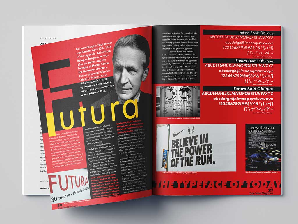
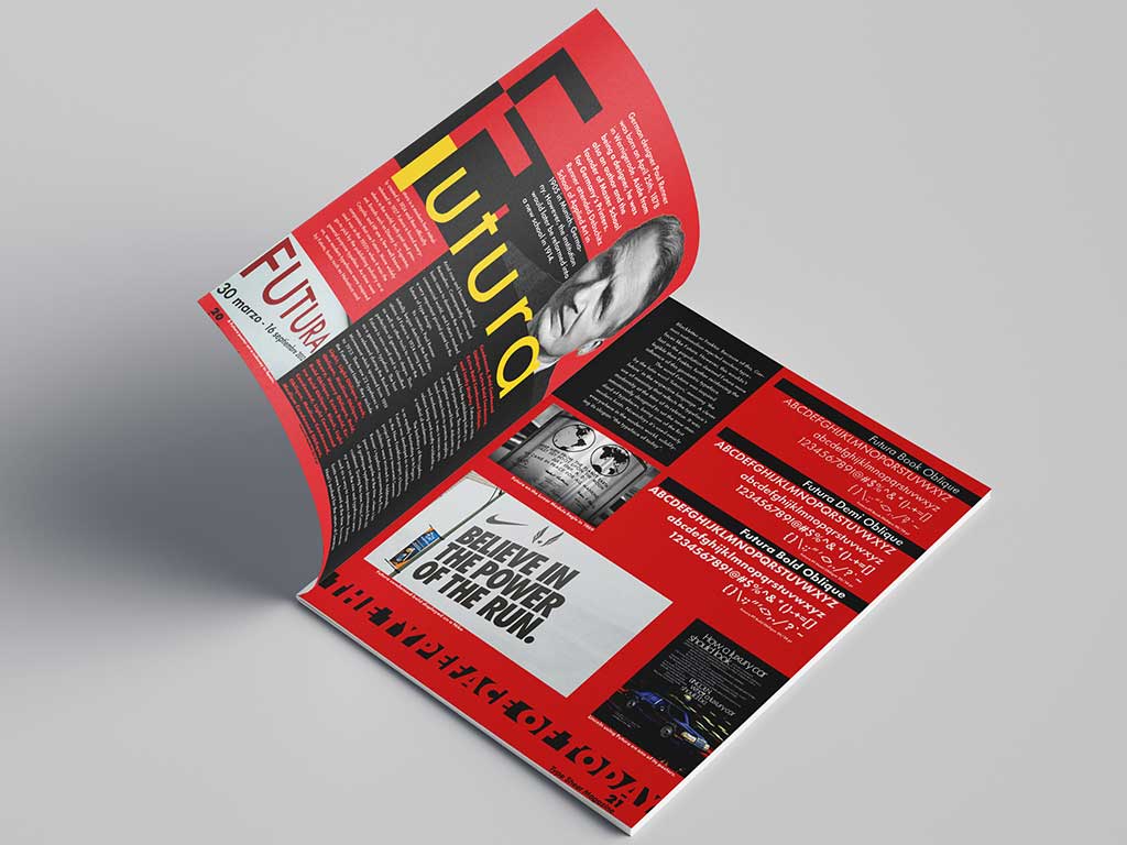
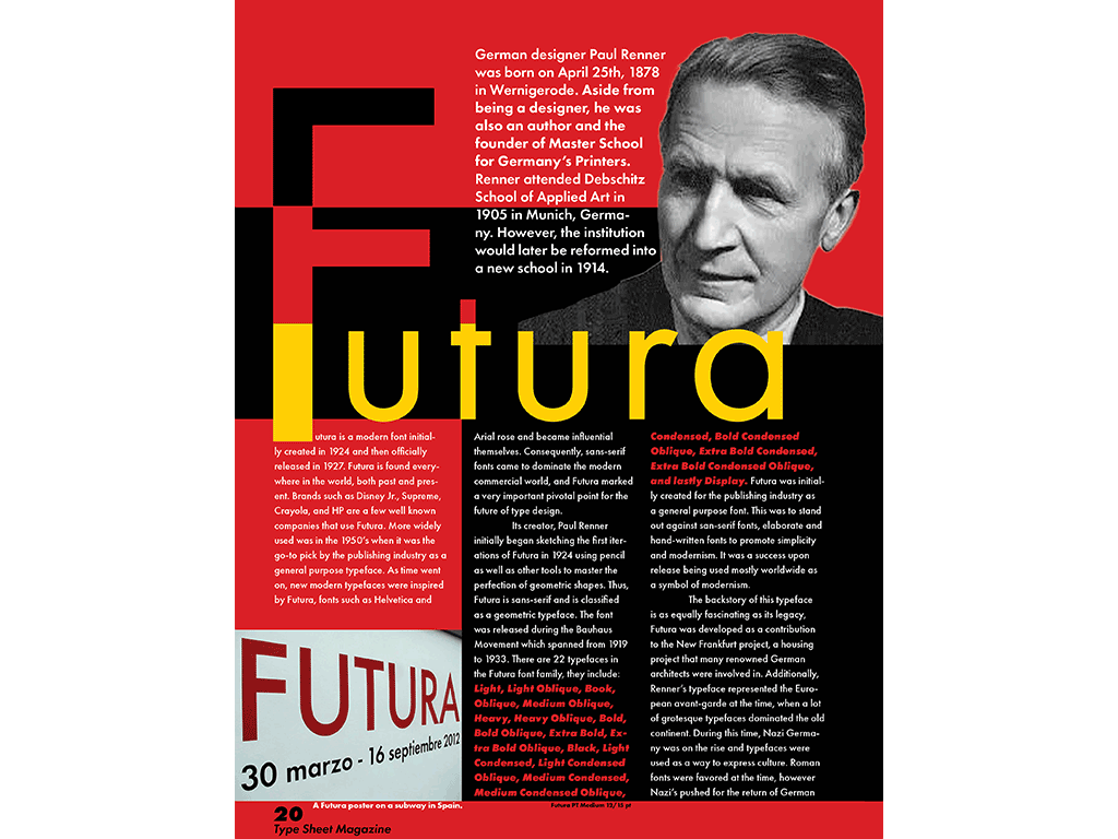
Futura
Project information
- Category: Typography
- Client: Intro to Typography
- Project date: November 2024
Content
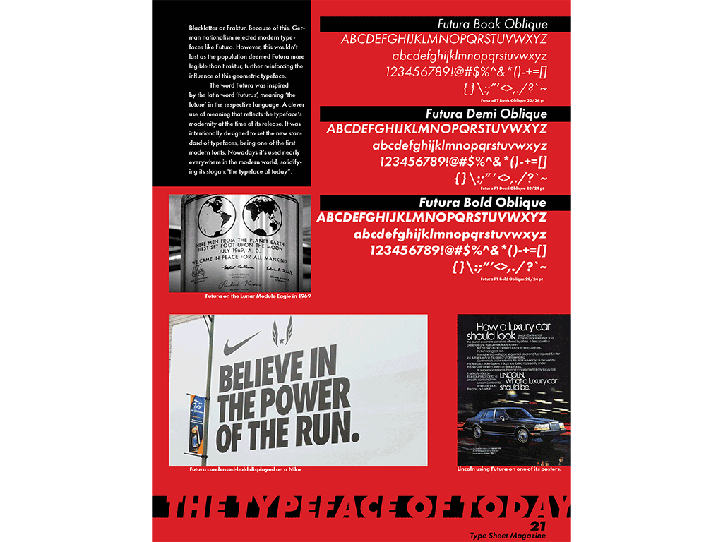
One of the styles of design that really catches my eye is typography. Sure I've produced good works in different areas but typography really draws my attention; composition, scale, weight, everything that applies to traditional art can also apply here. For my Intro to Typography class, we were given a typeface and asked to create a magazine spread about said typeface. I was assigned Futura, my beloved.
It started by delving deep into Futura’s roots, enough to make 500 words at least. This would be the content that would be within the magazine itself. After looking at some inspiration on Pinterest, I opened InDesign and began working on what is probably the project that I had the most fun working on. There was plenty of content to ingest within the spread, I even masked the title Futura and inserted the German flag within it. I created a certain treatment for the type specimen. You could say this treatment is my little trademark as it’s also present in my resume and magazine spread of my Mustang. Working on this project felt like a child playing in a sandbox, it was really refreshing.
It wasn’t all smooth sailing though, at that point in my career I had a not so special place in my heart for InDesign. As I came from Illustrator, it was challenging to get used to the key commands and little tricks. Eventually I pulled through and delivered a piece that I was proud of despite it being one of my first typographic works. This project brought out my love for Futura and typography as a whole. It was the process that made me realize that.